Lockdown
Strong UI and why 2D elements are just as important.
Making the 3D models that fill up the actual game was a huge part of of the artwork, but the 2D and UI elements of a game are just as important. This can tell viewers a lot about your game before they actually play it. Your game's logo for example, your color scheme, even fonts you choose or create yourself. These elements helped us build an overall "Vibe" for our game.
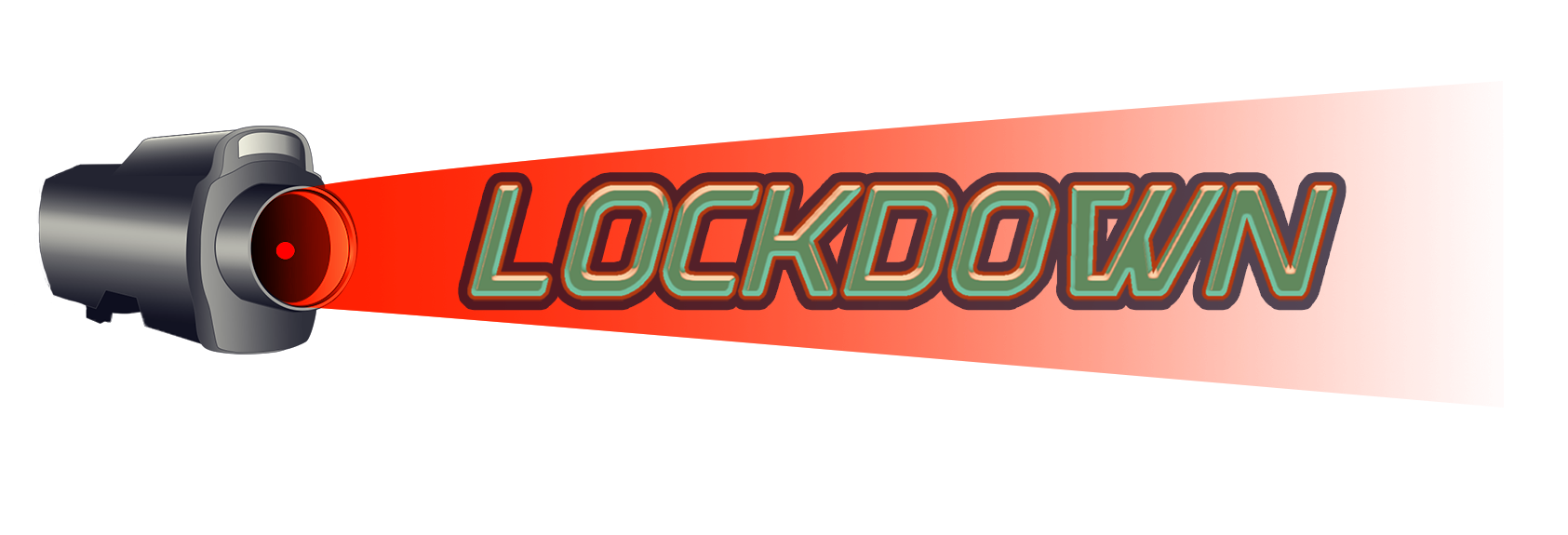
Our game logo was a great start, we were able to build a stronger color scheme starting here.

This logo was made using a font called "Discotechia" from fontspace.com we felt it was a great combination of our game's overall retro cyberpunk theme. All of the UI elements were made using Adobe photoshop. The fonts were downloaded then added to photoshop and different effects were adding in, including adding more strokes and Bevel/Emboss to add some highlights/shadows.
The colors used in the logo are a faded mint green, red and light red/peach. These colors were made with the colors of retro appliances in mind. Now we needed something to really make this pop, so a few other colors were brought in:
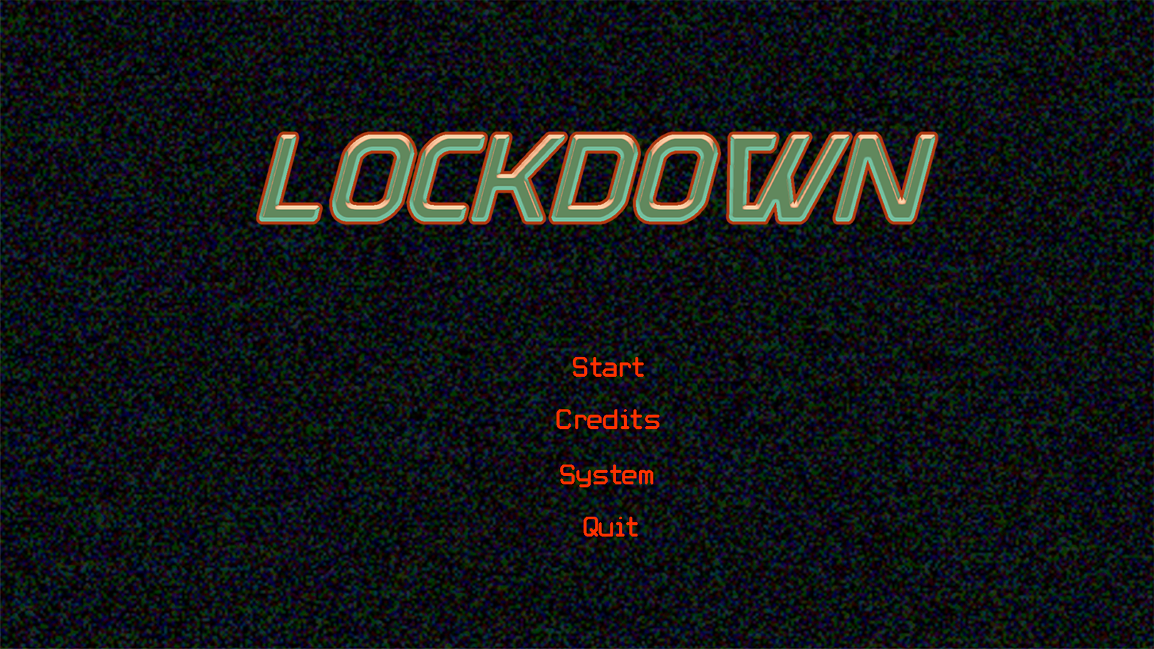
Our UI screens are meant to be a computer screen to go along with the opening scene of our game. A simple static gif was made using adobe after effects and a dark navy color was overlayed across the entire thing, The dark blue color along with the bright red color were added to make the logo pop but also these two colors added to our color scheme help to add to the cyberpunk part of our theme.

This was the color scheme we were left with! This leaves us with many options. The red was used for our buttons in our UI a lot and the dark blue color was later on used very much with other 2D elements Eventually we felt that our title page needed a bit more so a vector of our security camera was made and implemented in.

The security camera is a major part of our game because the main point of our game is to resist the AI instructor who is watching you from the video camera. The strong red light being shown on the title is to foreshadow how the camera is constantly watching the player as well as it's foul intentions. Showing the player this at the start of the game is meant to give them a sense of what to expect and hopefully fill them with these similar feelings of being watched by the AI.
Again using that strong red color to help the logo pop, a dark blue stroke was then added to the logo to help solidify it and the same dark blue was used in the camera vector in the shadows to make the dark colors pop more.
The secondary text for our buttons was then changed to a much more retro computer font. The static was not enough to bring in the technical and "Cyberpunk" feel so we changed to a simple "Retro Computer Font" taken from dafont.com

We also are using the color yellow as a highlighted text color to pop against the navy backdrop and to add more of a "tech" feel.
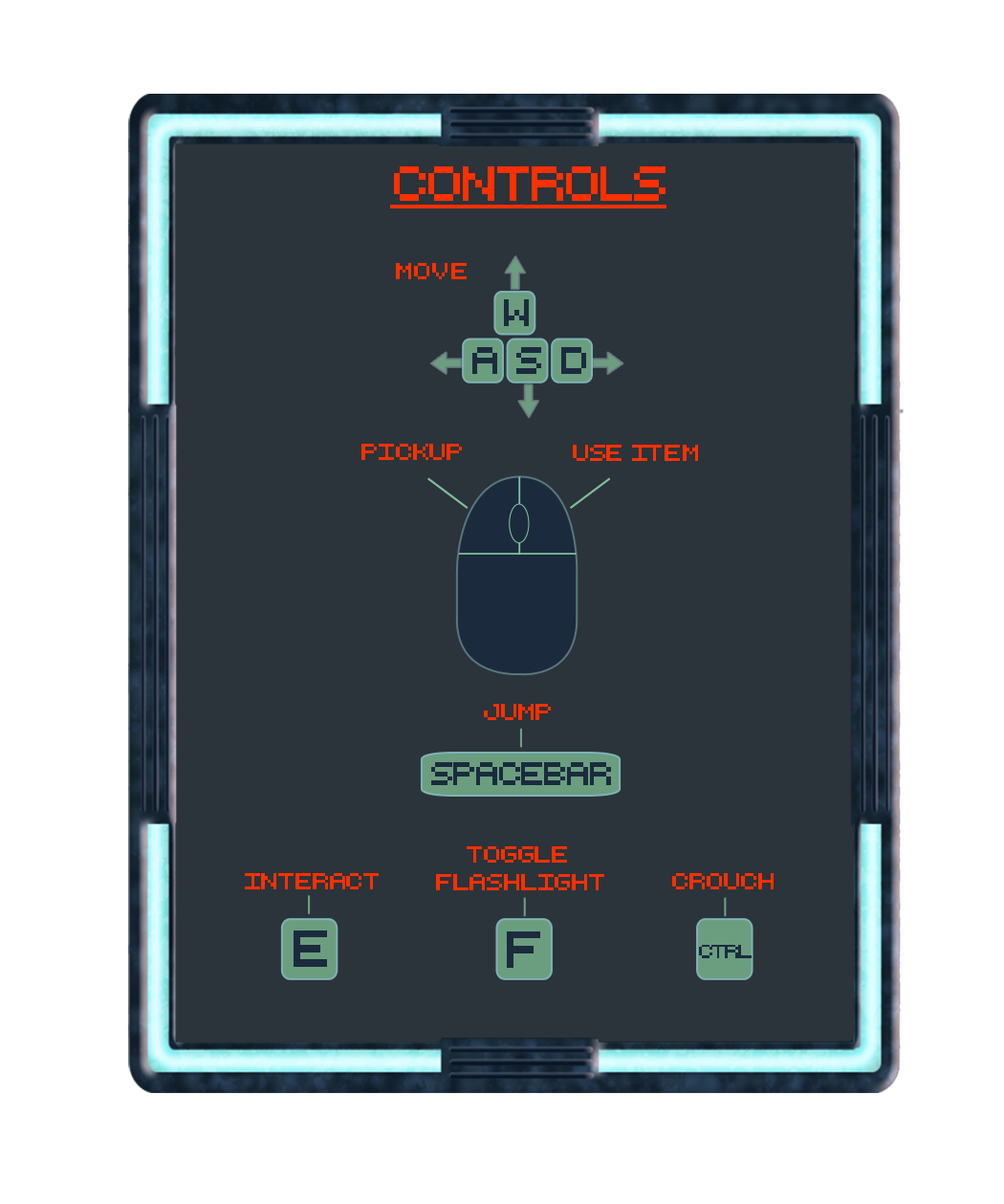
Here's is a peek of the controls scheme in our game. You can see here how we were able to keep using all of the elements we came up with to keep repeating fleshing out our game and were able to give it even more personality.
Thank you for reading about the development of our game and we look forward to showing you more content!
-Kristin Stetz
Leave a comment
Log in with itch.io to leave a comment.